2026 Fall Color May Be Later: Interior Design Strategies for Homes and Commercial Spaces
The original Country Living article notes that leaf-peeping season may be later in 2026 and recommends checking local foliage reports before heading out. For interior designers and homeowners, this is not only a travel reminder, but also a useful design prompt. When the timing of natural seasonal color becomes uncertain, residential and commercial spaces can be planned to prepare for autumn before the leaves fully arrive. The key is to translate foliage reports into spatial decisions: layout, materials, color palettes, lighting, and small details that help people pause, look outside, and experience the season more comfortably.
1. Residential Design: Make the Window the Center of the Autumn Experience
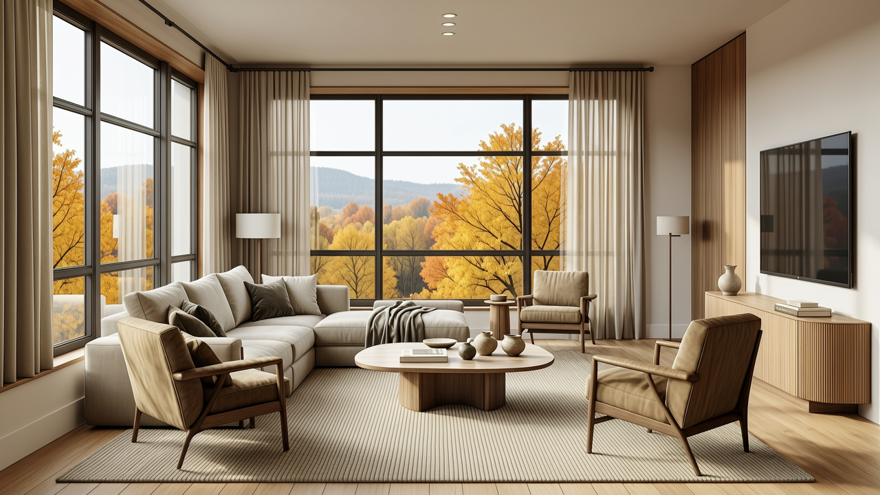
In living rooms, dining rooms, and bedrooms, the window view is the most direct link between interior comfort and fall foliage. A practical layout strategy is to keep windows visually clear. Tall bookcases, bulky storage walls, and high-backed sofas can block the view and make the space feel heavy. Instead, place seating, dining tables, and reading chairs so that the main sightlines face the outdoors. Low-profile furniture preserves openness and allows people to see tree canopies, light changes, and color shifts while sitting. Sheer curtains, blinds, or soft diffusing fabrics can reduce glare and help autumn light feel more gentle inside.
Material selection should support warmth without overwhelming the view. Natural textures such as wood veneer, matte stone, linen, wool, leather, and woven fibers create a comfortable base. If a space feels too neutral, use autumn colors in small doses: caramel, olive, brick red, or deep brown can appear through cushions, throws, rugs, and table linens. This approach is especially useful when fall color may arrive later than expected. The interior can already feel seasonal, while soft furnishings can be updated once local foliage reports show that peak color is approaching.
2. Apartments and Villas: Use Zones to Enhance the View
Apartments often have limited square footage, so design should focus on flexibility and visual extension. A bay window can become a small pause zone with a cushion, a low table, and a lamp. This creates a place to read, drink tea, or wait for the best foliage moment. Mirrors, glass partitions, and light-colored walls can increase depth and reflect outdoor views back into the room. Balconies should remain simple and uncluttered, serving as a transition between inside and outside rather than storage space.
Villas usually offer larger glazed areas and stronger landscape connections. In open-plan living and dining areas, circulation can be arranged around the best window view. Stair landings, tea rooms, master bedroom terraces, and reading corners can all become designated observation points. Materials such as weather-resistant wood, metal window frames, stone, and large glass panels can strengthen the indoor-outdoor relationship. Color should remain restrained. A neutral palette allows the changing foliage to become the visual event, while seasonal accessories can be changed without redesigning the whole space.
3. Commercial Spaces: Offices, Shops, Restaurants, and Hotels
In offices, window-adjacent breakout areas can become useful places for employees to check local foliage reports, plan weekend trips, or simply take a mental break. A small digital screen, corkboard, or framed poster area can display foliage information in a way that feels relevant and local. This echoes the original advice to check foliage reports before heading out. Layout can place tea pantries, phone booths, and quiet reading corners near good views, turning seasonal change into everyday spatial value.
Restaurants and shops can benefit from window-side seating and clear sightlines. Bar counters, semi-private booths, and low display shelves can guide attention toward street trees without blocking daylight. Warm lighting should complement the outside scene, especially during late afternoon and evening. Color palettes can use wood tones, gray-green, caramel, and cream to create a calm seasonal mood. Avoid large areas of highly saturated red, which may compete with natural foliage and make the space feel visually loud.
Hotels and lobbies are ideal for creating 'stoppable autumn scenes.' Atriums, lounge areas, lobby bars, and corridor end views can all become framed moments for viewing fall color. Stone, wood, textiles, and metal can create a refined yet comfortable atmosphere. If the leaves are not yet at peak, interior design can still establish a seasonal feeling through changeable soft goods, plants, and lighting. When local foliage reports indicate that peak color is near, the space can quickly add autumn-themed displays to enhance guest experience.
4. Design Principles: Queryable, Adjustable, and Stayable
First, make the space queryable. Entryways, reception desks, lounge areas, and living room sideboards can include a small spot for local foliage reports. This can be a digital screen, a framed notice, or a simple board. Second, make the space adjustable. Use a neutral base and seasonal accessories so that cushions, rugs, curtains, bedding, and table runners can be updated with low cost. Third, make the space stayable. Every room should have at least one comfortable seat facing the window, inviting people to pause and observe light, leaves, and weather.
5. Material, Color, and Layout Checklist
For hard finishes, choose matte and low-reflection materials such as light microcement, matte tiles, wood veneer, and soft paint. These surfaces let the outdoor foliage remain the main character. For soft materials, add linen, wool, leather, and woven textures to improve tactile comfort. A useful color ratio is seventy percent neutral base, twenty-five percent supporting natural tones, and five percent autumn accents. In layout, keep the window edge clear and arrange furniture from lower to higher profiles. Combine natural light with warm artificial light, but avoid harsh glare that can flatten the autumn atmosphere.
If leaf-peeping season is later in 2026, interior spaces do not need to wait passively. Designers can turn the advice to check local foliage reports into a concrete spatial language: organize circulation around window views, build warmth through materials, leave room for seasonal change through color, and create places where people can stay. In this way, homes, apartments, offices, shops, restaurants, and hotels can all become ready-made containers for appreciating autumn, whenever the leaves decide to turn.


